Ceramics Art and Perception: Tineke van Gils

TinekevanGils

For the fourth installment of my Ceramics Art and Perception reading, I found myself particularly drawn to Quietly Continuing- The Teapots of Tineke van Gils, by Anthony E Stellaccio.  These teapots are made of porcelain from Dehua, China, and the main characteristics of this clay is that it has an extremely short working time.  It is so un-plastic, that any wet working must happen quickly and precisely, and then be done.  This is a striking disparity against what van Gils work ends up looking like.  The teapots in the article are beautifully fluid, luxurious, and pristine.  This, accompanied by the author’s description of van Gils as a joyful thrower, is a wonderful result.  In thinking about this relative to our themes this semester: origins and identity, this is such a lovely combination- taking something fundamentally (originally) unworkable, and giving it a fluid and beautiful life (identity).

Not only could that be a metaphor for life, but these teapots are just plain gorgeous as well.  Teapots are one thing I have thoroughly enjoyed making, but have never found a voice in, and these are very inspiring in that regard.  Looking at the photos in the article, the swooping handles, spry spouts, and precisely altered bodies all combine to show van Gils joy in throwing, and belie the difficulty of the clay.  I could look at these all day and see some new detail to find joy in every time.

Notes on forgiveness…

This is a reflection post. Photos will be forthcoming of the work happening during this process.

I have been overwhelmed with everything I’ve been working on, from art history to studio work, to teaching, to my coffeeshop job…  I have also not been prioritizing time well.  I could make all kinds of excuses, but really, it comes down to priorities, and the fact that I have always held myself to in-achievable standards.  This, in and of itself, has been a huge and meaningful experience for me.

To have always held this ideal of myself as the ivory tower of my existence, and having beat myself senseless in the face of “failure” has not been helpful.  And I say “failure” because I am not failing, but I am not living up to the standard that I set for myself, which is basically “Be The Superhero, Or Shut Up And Go Home”.  But you can’t just shut up and go home when you’re in school.

I have been working with a student in the classes that I teach with exactly this same set of tangles.  It has been invaluable to me in my efforts at success in my Grad School program, which makes me humbled and grateful that I can do these two things at the same time, and see the results immediately.

So, this semester, as I soldier on, aiming as high as I can, I am learning to be kind to myself, the same thing that I have told my student.  Aim high, do the most you can do, but be kind to yourself when you don’t measure up to some impossible standard you measure yourself by.  Forgive yourself for being the person you are, and move forward.  It doesn’t mean you can’t do better, or won’t do better, it just means allow yourself the grace to find your new and real best.

So, blessings upon everyone for doing their real best, regardless of outside or inside voices. Power. On.

Ceramics Art and Perception: Hong-Ling Wee

As I have perused the issue of Ceramics Art and Perception we were given at the start of the semester, I keep bouncing back to the review of Hong-Ling Wee’s show, Soft Lines, Hard Edges.  This work is an installation of 30 clay houses, arranged precisely on some of the most satisfyingly constructed shelves I have ever seen.  But shelves aside, I was struck my the almost birch bark appearance of the house details, which upon my first glance many weeks ago, I discovered are actually delicately carved and incised windows and doors, glimpses into the interior home-life of one of the most exquisite villages I have seen. These subtle details balanced against the bold coloring of the roofs, and the stark black of the shelves, create an environment that feels very rooted and solid at the same time as there is a magical sense ethereal storytelling.  I wish I could find a good photo with sharing permission that shows the shelves and overall display, but this one captures the essence of what the photos in the article portray:

Hong-LingWee

Photo courtesy of Pinterest

Ceramics Art and Perception: Tomoko Abe

TomokoAbeErosion

I had never encountered Tomoko Abe’s work until Tomoko Abe’s Weathering Scape by Leigh Taylor Mickelson, in Ceramics Art and Perception, Issue 92, August 2013.  Her use of clay and the environment to create seemingly ephemeral, yet intimately resounding work is a testament to clay’s permanency and fragility.  Using porcelain casting slip, gauze, egg cartons, tennis balls, paper, and photosensitive ink, Abe has created pieces that record the effects of her work practices, as well as the imprint of the world around us, even impressions of rain drops in some of her slab pieces.  There is a sense of tenderness attached to these works that belies the fact of their permanence.  Abe notes, “In these pieces there is the same tension, healing power and forgiveness that this earth offers to us.”

Photo courtesy tomokoabe . com


Ceramics Art and Perception: Linda Christianson

In response to the article on Linda Christianson’s pottery in Ceramics Art and Perception, Issue 92, August 2013, by Robert Silberman:

I have to admit, I always start reading about artists (in any media) having spent time looking at the images of their work, and I am often swept up in sheer glee by their forms and decorations, only to have my joy dashed upon the rocks of some personality trait or prideful remark. This, however, is not the case with Linda Christianson’s work.  I have been drawn to her forms for quite some time, but had not read specifically about her until this article. The forms of her small ewers and mugs shown in this article almost make me want to giggle uncontrollably. Strange, but true- it’s something about the proportions. According to Silberman’s observations in this article, Christianson views her work not as sculpture or art, but more “like engaging tools than anything else.”  He also notes that sense of humor infuses her work ethic, which leads me to believe my response is, perhaps, not unwelcome.

The proportions of this little mug, with its low handle and squat precision, plus stripes, is the essence of what I love about Christianson’s work.

LindaChristianson3

The same stripe motif on this ewer, along with the lid and handle, are also delightful.

LindaChristianson4

I hope I encounter her pottery in person some day and can choose a piece for myself.

Photos courtesy of Pinterest


Newest work from Fall Semester 2014

I have been unfortunately lax in posting work up dates this semester.  Hopefully I will get more timely in the coming weeks.  The following pieces are all handformed earthenware with stains, underglazes, and glazes.

The goal for the set of work was based in the parameters set this semester, starting with Origins: PLACE.  These are all stories and images from growing up in Tennessee on the side of a mountain, with my mom and dad and sister.  We are a tight-knit crew, with animals and the woods as our uniting enthusiasms.  I chose these stories because they all happened at home or began there, and have continually shaped who I am today, which seemed a good way to also lead into our next segment, Origins: IDENTITY.

Each tile is approximately 12 x 12 x 2 inches, and the inside tiles are each approximately 6 x 6 x .5 inches.

Austen:

AustenReview Austen2Review

Brave Walker:

BraveWalkerReview BraveWalker2Review

Existential (please ignore the typo- I will be keeping this one in my permanent collection):

ExistentialReview Existential2Review

Feral Agent:

FeralAgentReview FeralAgent2Review

Orange Beanie:

OrangeBeanieReview OrangeBeanie2Review

Potato Mine:

PotatoMineReview PotatoMine2Review

Woods Running:

WoodsRunningReview WoodRunning2Review

All of them in my trusty car:

AllReview

The removable nature of the inside tiles makes these pieces highly successful for me.  That the placement of the story is behind the image and requires viewer investment makes me feel much more comfortable sharing vulnerable stories, and I look forward to pursuing this idea further. Following is the project outline I wrote for this project at the start of the semester:

Continuing in the vein of Graphic Novel aesthetics, but joining the brick idea from Spring 2014, I will construct a series of press molded Earthenware shadow boxes, finished with white underglaze and stains. Within these shadow boxes will be placed small “treasure” tiles, with additional pieces of the memoir-esque storyline carved and drawn. Text, if there is any, will be stamped into the inner sides of the shadow boxes. This is to explore ways to maintain a high level of vulnerability, which is essential for my feeling of success about this work, but also express the tenderness of childhood memories and encourage investment from the viewer in exploring these observations and narratives.

To connect this idea to the assignment- Origins: PLACE, will focus on stories and observations from growing up with my family in Tennessee. Since I spent a large portion of my undergrad and a year post-college, as well as substantial portions of my teaching career, doing pinch/coil and pitfiring, I am instead going to focus on pushing my comfort level with Earthenware and low temperature glazes.

Given my propensity for odd numbers, and my unreasonable enamoration with the number 7, I will make 7 of these. This also continues the connection to Spring 2014, since those tile series were also sets of 7.

Fall 2014: Minoan Pottery and the advent of the potter’s wheel

With the arrival of the potter’s wheel in Greece, in basic form, around 2000 BC, possibly from Egypt, where it had been in development since possibly as far back as 4000 BC, aesthetics advanced substantially.  Not only did forms become much more symmetrical and more easily mass-produced, the decoration changed as well.  From simple narrative and symbolic images like this piece from Crete, c. 1500 BC:

MInoanOctopus

Came these more geometrically informed pieces, clearly lined on a wheel of sufficient advancement to turn smoothly enough to allow for even lines to be brushed on the full circumference of the piece:

MinoanCyprus13001200BC

(Minoan Octopus jar from 1300-1200 BC)

At around this time, the Greek mainland economy gained traction with trading pottery and other products, cross-pollinating with surrounding cultures, particularly the seafaring Cypriots, who adopted some of the Minoan aesthetic themes.

Pottery from this time on advanced in skill and refinement, still using images to relate cultural life and portray important elements of daily activities.  These pieces of later work on mainland Greece, approximately 530BC and 500-300BC respectively, appeal to my story-telling and illustration aesthetics.  The crisp forms, too, while tying back to historical forms, give the work a clean and pure visual punch.


PanathenaicAmphora530BC RedFigureAmphora500300BC

Honestly, these images also remind me of our first video games on our Tandy 1000 computer.  There was a little guy that you ran around through mazes, solving puzzles, and there was one stage that was all Greek mythology, and you gleaned clues from the paintings to get through the mazes faster and win. My sister and I would hover over each other when we played and it was all super intense.  For part of it, if I recall correctly, you had to find clues while racing spiders, which caused near panic a few times.  Some serious nostalgia right there.


Fall Semester 2014: Ancient Ceramics

There are so many things that appeal to me about Ancient Ceramics. There is a certain rawness to the work that I’m drawn to every time I see a piece of work from early in Ceramic history.  I am grateful for the opportunity during this semester to revisit some of what I spent time researching fresh out of college, 14 years ago.  Since those memories have long since faded, I am glad to reorient, and have a chance to revisit what drew me to these early time periods.  The first things are the relative roughness of construction, given the hand forming technology at the time, and the similarities between decorative techniques across the world over centuries.

The first piece in our assigned research that struck my fancy is this vessel from Nubia, Africa, from about 2000 BC.

NubiaAfrica2000BC

Not only does this piece exhibit one of the forms I first encountered and loved, it is pit fired, which I worked with a fair bit after graduation. The voluptuous roundness and slight asymmetry of these forms has always been hugely appealing to me, both for the fullness and blessing that roundness seems to convey, but also as a release from my incessant desire for “perfection” and therefor permission to let go of precision symmetry.  If these same pieces were perfectly symmetrical, it seems that some of their sense of life would fade.  This was a huge lesson for me early in my ceramics career.

The decorative lines and dots are interestingly parallel to several motifs from Native American pottery traditions as well.  Given the cultures these pots likely came from, I wonder if the symbolism is also related, as far as diagonal lines often connoting rain and clouds, hoping to bring blessings on crops and the land in general.

Another piece that caught my eye is this Gansu Bowl from China, even older, from about 3200 BC.  These lines and shapes also echo Native American pottery, though that is much more recent history.

GansuBowl3200BC

I keep coming back to the Native pottery angle because I teach a section on this in my beginning ceramics classes, which we just completed.  It is the first place that I tie my students into history, and give them each a context to the techniques they are learning.  I hope that does for them what these pieces do for me, in that I belong to something bigger than myself, and am currently part of something future generations may look back at and find place in.

Addendum:  Upon further conversation, it is worth taking note that much of African pottery technique has remained the same through history, while Chinese ceramics quickly adopted the potter’s wheel and then mold-making for mass-production.  This is particularly interesting as we move into Greek and Roman pottery, where the potter’s wheel became and integral part of their craft.

Ninth and Tenth Top Ten Narrative Tile Makers

My ninth and tenth top ten artists are Ruth Faktor and Marianne Huhn.

Ruth Faktor is an Isreali artist who lives and works in Tel Aviv.  She works most frequently with figurative images, portraying friendship, siblings, family, and home themes.  Her bas relief carving is simple and refined.  She draws from the architecture of Tel Aviv to form pathways and show journeys, and texture and matte to gloss finishes to bring depth to the images. She had a well received show in East Lansing, Michigan at Saper Galleries and Custom Framing.

RuthFaktor RuthFaktor2

http://www.sapergalleries.com/RuthFaktor.html


Marianne Huhn is from Melbourne, Australia.  She has taught and lectured all around Australia and draws from architectural and street themes to express concealing/revealing who we are and how we choose to portray ourselves.  She also uses landscape and text to create tender and slightly ethereal vignette narratives of life.

While she doesn’t actually work with tiles, her line and color work are two things that are absolutely inspiring to me.  She throws her pieces and leaves finger marks inside to leave her craft marks intact.  This idea of leaving your mark, a deep root, under the precise  illustrations of the outside surface is greatly appealing.

HUHN-2 Marianne-Huhn-You-are-here-2007 new-work-2011-base-close-up1-630x418 which-way-home-2011-630x492http://www.mariannehuhn.com/


General Update of Work and Ideas

A few weeks ago, my brand new computer’s hard drive crashed.  Still dealing with that, but in the mean time, I have been able to rebuild my photo files and invested in a smart phone, which should allow me to upload photos and everything else and keep things up to date here!  I feel like a crazy zippy technology wizard! Pow!

Which doesn’t really relate to anything, but it’s part of the ongoing narrative of this time in my life.  A few days ago was also the anniversary of my car crash, and I must admit to feeling rather proud of the changes I’ve made and pursued since this time last year.

Projects:

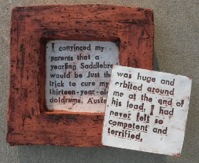
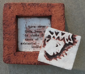
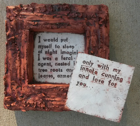
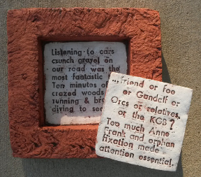
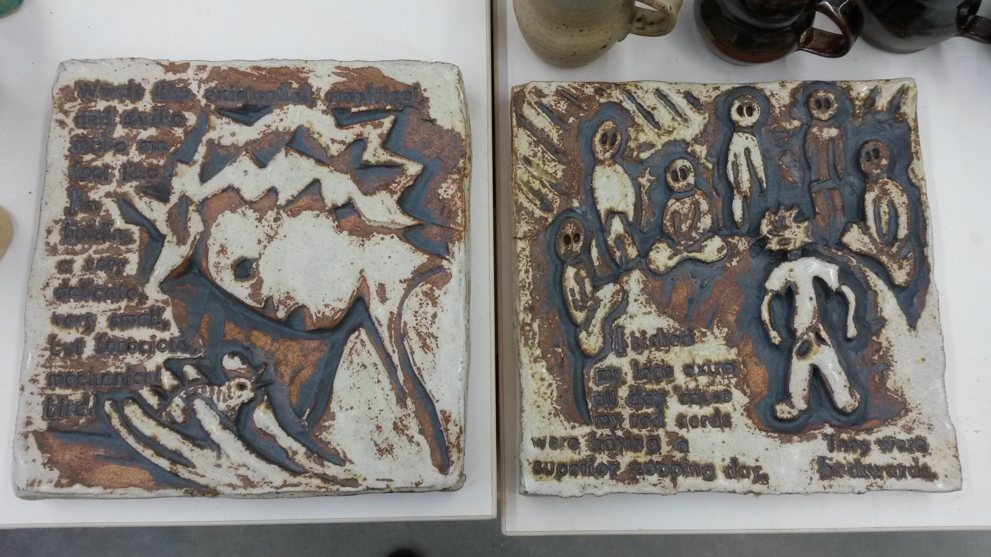
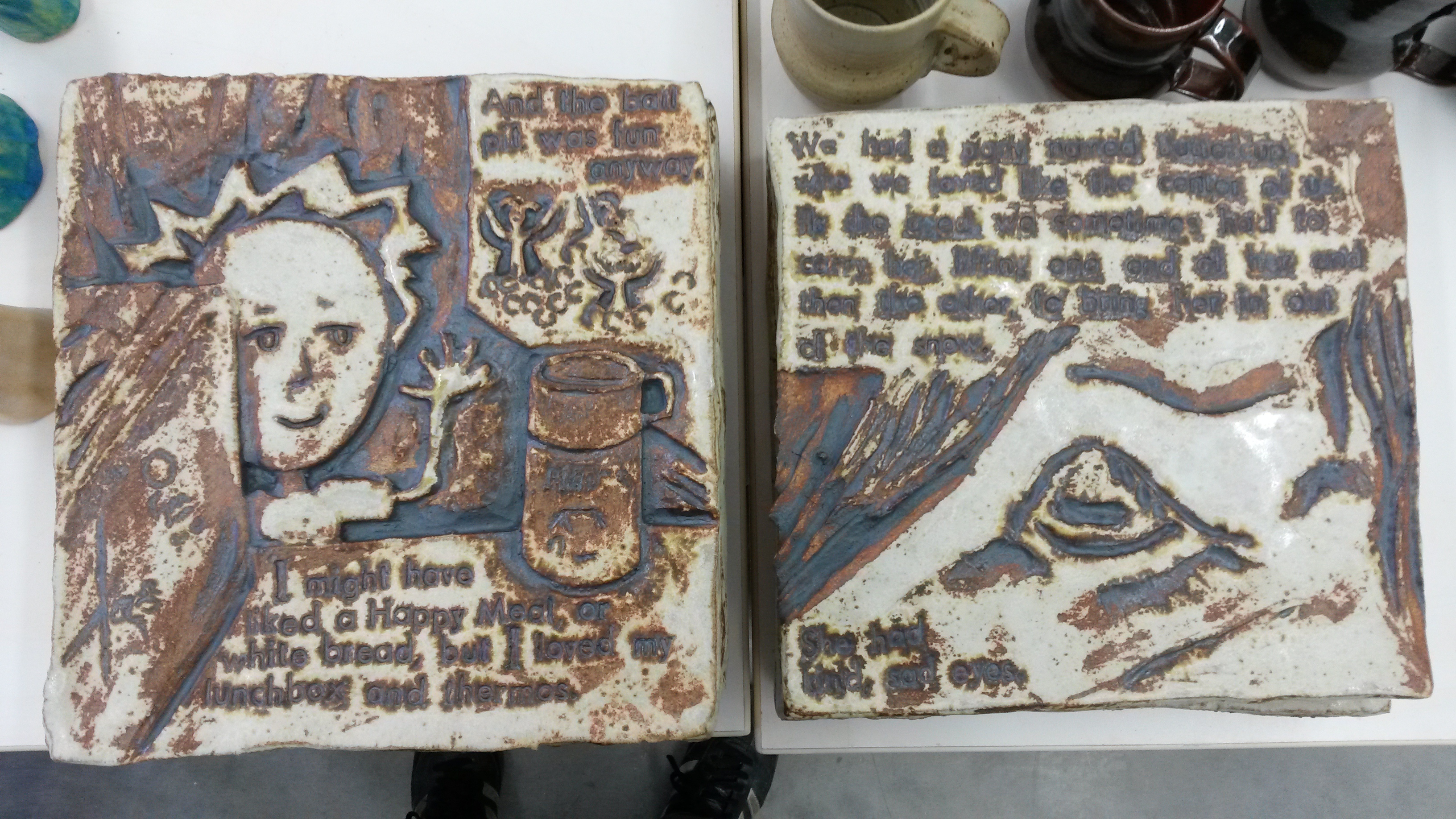
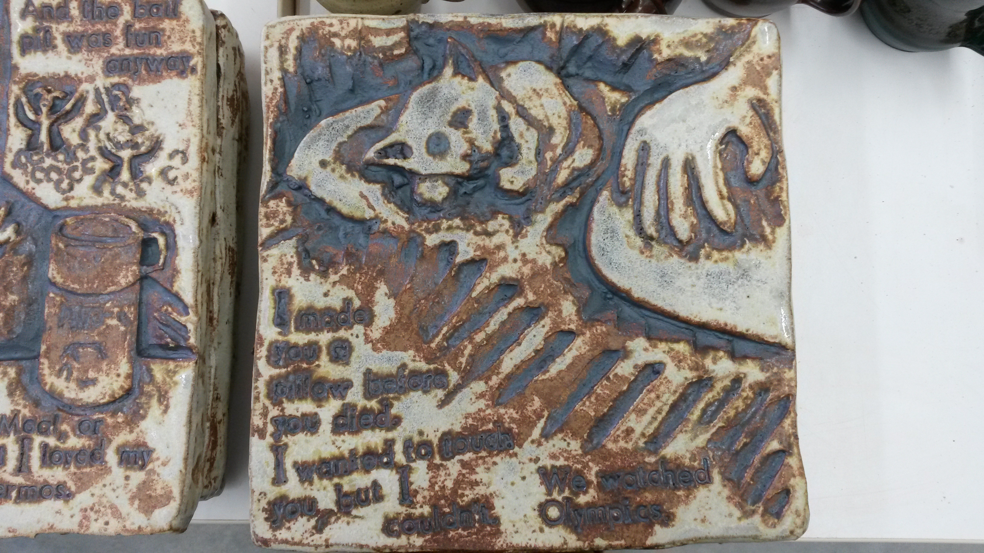
I have completed a second series of Graphic Novel Inspired Autobiographical Tiles, which turned out well, with the exception of some firing related glaze bubbles which somewhat obscured some of the letters.  I will be re-firing these to see if I can settle the bubbles down.  This series was the first with my delightful type-set.  I find I may be losing perspective on how well the lettering works, simply because I love the delivery- it’s very methodical and meditative, and I am thrilled by the sort of “old typewriter” look.  I need objective witnesses.   Here are photos:

wpid-20140415_114042.jpg

wpid-20140415_114911.jpg


wpid-20140415_115030.jpg wpid-20140415_115248.jpg

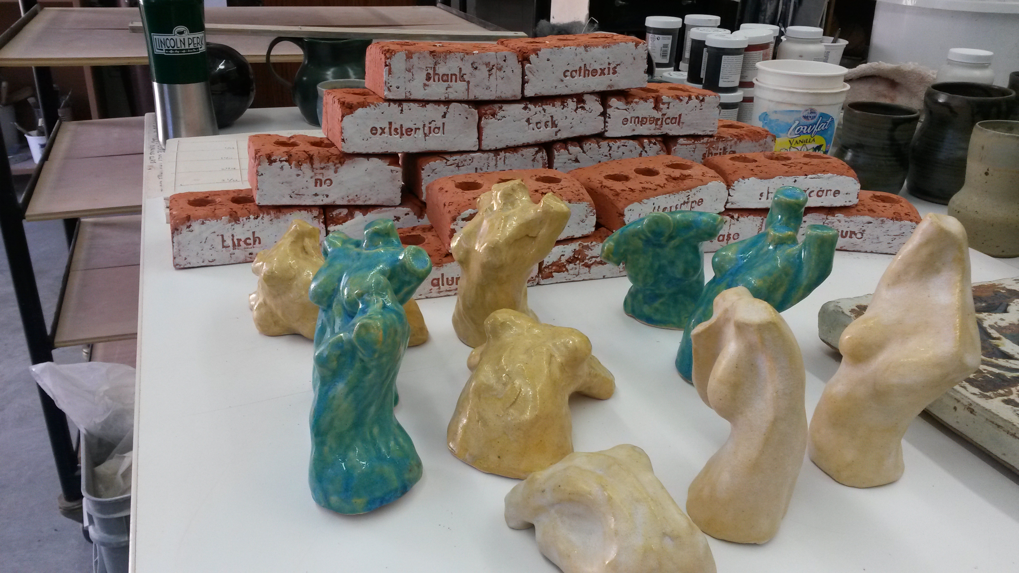
Then, I am working on a series of Story Bricks, each stamped with my favorite words.  This current bunch is, I hope, the starting point of a longer series, even just for my own fun, that will continue to document the words that I find particularly satisfying to use, or their meaning is important to me, or I just like how they sound.  The idea is that viewers can stack and re-stack these bricks like a 3D magnetic poetry set, but instead of making poems or sentences, these bricks will form a wall or pile of visual and verbal textures.  Communication is sometimes hard, there are walls and small gaps, and there are intents and then understandings, sometimes inexplicably achieved.  How do we ever really know if we are understanding exactly what someone is telling us?  And how do the “feelings” of words work to portray that?  My current favorite combination:  Shrike, Empirical, and Cathexis.  These form this logic in my head: a Shrike is kind of hawk, a great observer, the eagle-eye, forming Empirical views, objective realities, which in turn confirms existence, giving meaning to the objects in view (a side-long interpretation of Cathexis).  Oh, god, the nerdery.  This may be complete BS, but I love how each of these words could tie to the others, and as I keep moving them around in the studio I see more and more of these connections.

wpid-20140415_114035.jpg


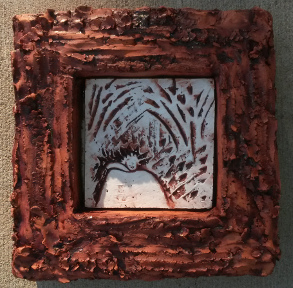
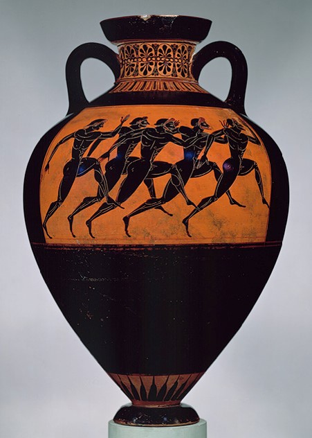
The figures in this photo are body language studies for this piece:

wpid-20140422_105950.jpg wpid-20140422_110001.jpg wpid-20140422_110024.jpg

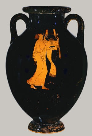
It is based off of a combination of two of these small figures, and this piece, which is the sculpture that could have impaled me, but didn’t, in my car crash a year ago.

wpid-20140425_201936.jpg


It is also a continuation of some previous work, finding figurative but somewhat organic forms to depict growth and change, which has been a lot of what this past year has been about.  For this piece, I was looking for shapes like the ecstatic arching up of bulb sprouts, coming out of the earth in the spring.  Also, abstracted spine and lumbar musculature- some of my favorite human shapes, combining grace and core strength simultaneously.  This piece, I think, embodies a lot of what this past year has been for me, stretching into new purposes, and a new(ish) feeling of enthusiasm for these purposes, including Grad School and new jobs, and shaping my teaching work to its best potential.


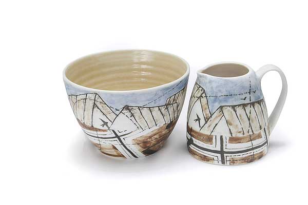
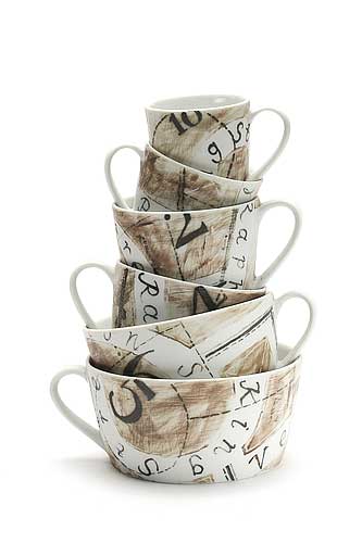
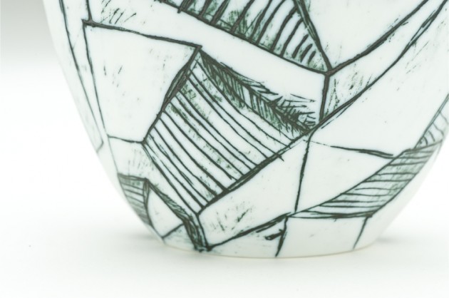
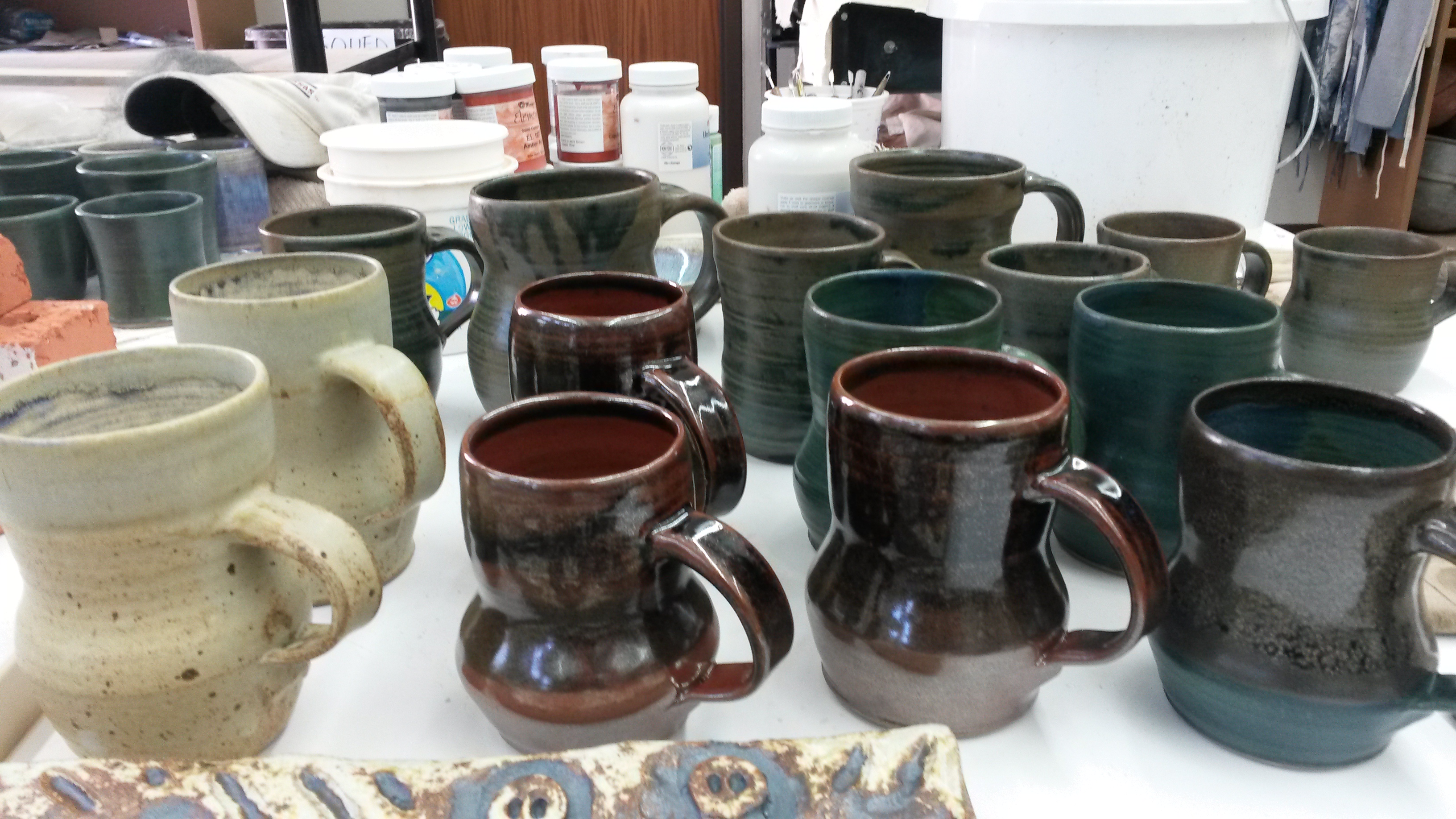
These are the continuation of the mugs from the first half of the semester.  I just am not drawn to make super fancy mugs, though I will keep pushing to find what mugs are really “mine”, and these are by far my best ever good-useful-mugs-with-more-character-than-before.  I had a few weeks of spectacular throwing luck, and the walls are thin and solid, with handles that I am growing very fond of.  The handle angle allows you to hold your wrist straight and drink, for the most part.  They slope downward slightly, which must be a visceral shape to me, because I just can’t stop looking at them.  I wish some of the lips were just a touch thicker, but I love the feel, and am looking forward pursuing this series further in the future.

wpid-20140415_114028.jpg

On the whole, I am very satisfied with these series’.


These are my two most recent glaze test pieces, Copper Carbonate and Cobalt Carbonate:

wpid-20140415_114015.jpg


I want to eat the blues.


I love doing these different colorants, and weighing out the recipes.  Comparing subconsciously which ingredients are heavier, like a pile of EPK is almost double a pile of Dolomite of the same weight.  Fascinating.  Or that when I weighed my Rutile tests this week, it was really hard to get the smaller measurements, because Rutile is such a molecularly heavy material, where weighing the same gram amount of Copper Carbonate made a much larger and more easily reduced pile.  Dig it.

So, this is where work is at right now.  Kiln firings this week.  More to come.