Sixth, Seventh, and Eighth Top Ten Narrative Tile Makers

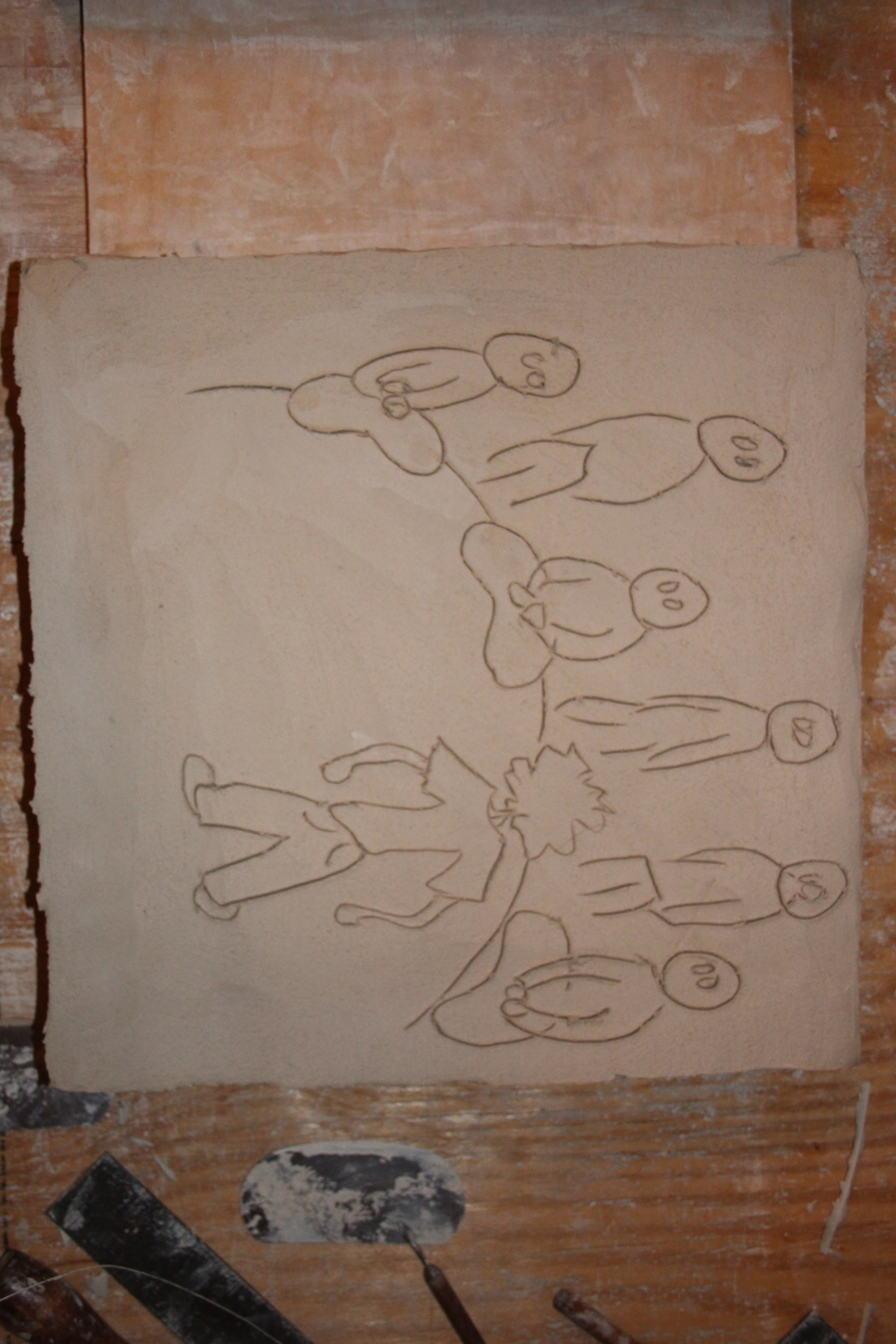
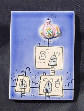
Ceri White lives and works in Dunning, Perthshire, Scotland, and uses earthenware tiles with press molded additions to create whimsical architectural scenes she calls Ivory Towers (there are other domestic and nature scenes as well, but I am most drawn to the architecture). There is a lightness of spirit in her work that draws me in, and I hope I connect to that brighter element as time goes by with my work.   The simplicity of her images is also inspiring to me in the search for image vocabulary.  Also as a contrast to my heavy carving, the delicate lines of the images is something I keep thinking about.   http://www.ceriwhitestudios.co.uk/ivory-towers/index.htm

CeriWhitefrlongtowerlime CeriWhiteIvoryTowers CeriWhitesmtowaq


Angela Walford works mainly with Shino glazes on functional ware, but has these beautiful printed and glazed tiles.  She lives and works in Southern Australia.  These images interest me as I plan to work with screen printing (and other methods of printing) images onto tiles in the future. I love the textures and rough edges and simple color use.  http://www.angelawalfordceramics.com.au/gallery/

shino-ang-walford-feb-2014-29-150x150 shino-ang-walford-feb-2014-31-150x150


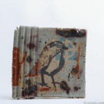
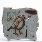
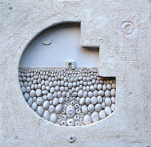
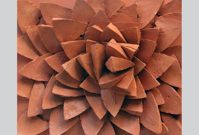
Angelo Mazzoleni is Italian, and this is the only image of his clay work that I can find.  He appears to work mostly in mixed media.  There is a rustic simplicity to his aesthetic I really like, and in this particular piece, the variation of texture is delicious.   http://www.absolutearts.com/portfolios/a/angelo/


AngleoMazzoleniDimensioni


Fifth Top Ten- Kerryn Madsen-Pietsch

My fifth international top ten artist is Kerryn Madsen-Pietsch.  Kerryn lives and works in Innisfail, Queensland, Australia.  She works in a number of different media, mostly painting and mixed media, all with a similar organic vibe.  She only has two images of clay work posted on her website, but I was immediately drawn to them in the sea search images I was digging through.  She has worked for many years honing her craft, and exhibiting extensively.  She also is the owner and curator of an art gallery in the town where she lives.  I take note of that out of admiration, that she is actively pursuing her own work, and also running a business of her own.  Specifically, this gives me hope to continue balancing all the stuff I have going on and still be successful in some form.  No to mention her work!  I love the organic shapes of all of her work, no matter the medium, and in these two images:

768_20042164815Social_Commentry

I love the depth and intricacy of the carving.  And the energy of the imagery she chooses.  This particular piece is from 1988, and you can see in subsequent paintings and other pieces how these shapes have evolved.  However much or little of ceramic art Kerryn has done, these pieces jumped out at me for their monochrome finish and energy of line, and rang in my mind as another landmark for the carving I hope to pursue myself.

20078155447Set_3_Nude_PorcelainTiles

This piece is from 2001, and the carving and shapes have clearly evolved.  I love the clean lines and the bold but simple presentation.  The added element of the figure also caught my attention, since I hope to join the tile elements I’ve been working on with the figurative work I was working on last year.  Having run about a hundred different renditions of that through my mind in the last few months, this image will serve as a note for the possibilities that I hadn’t really considered consciously, though that ring true now that I’ve seen it.


http://www.visualartist.info/kerrynmadsen-pietsch/cv

Second Series workin’…

This really should be my Fourth series, but I got overexcited right at the start…  And progress is halting and then manic, but it is progress nonetheless.  Even from the first one till the couple I’m working on currently, I can feel the shapes and textures and fluidity of form coming more naturally.  This. This. This.  I would do this forever if I didn’t have other things to do and push, too.

I did get paralyzed on language for a while.  Trying to find the right words was just getting stupid, everything was ridiculous and dissatisfying.  Like I started to feel like my brain didn’t work anymore, and that nothing was ever going to work, ever again.  But that is not the case, and instead of waxing verbose and ponderous, I’m learning to cut right down to the chase with the text.  Which is pretty much the point.  An image and some words to tell the story, both feeding each other, ideally.

It’s interesting watching the psychological part of this.  I’m digging up a bunch of tender and raw and funny stuff from growing up, and it’s weird how totally exhilarating and distressingly vulnerable that is.  It leaves me feeling both very calm and a little bit scorched by the end of the day.  But that’s also the point.  I don’t want to do it if isn’t getting at the crux of something.

I learned a really good word today, too:   cathexis.  “In psychoanalysis, cathexis is defined as the process of investment of mental or emotional energy in a person, object, or idea.” (Wikipedia)

(I know, I know, it’s not a real source.)  But it is a real word, and I love that it’s an actual thing.  I’m sure, being psychoanalysis, there are good and bad aspects, but for now, until I learn more, I am happy with the simple definition.

And this happened, but I’m happier with the second rendition now:

IMG_0075Karma Cat thought it was amazing and wanted all the bits to be her very own.

IMG_0079

I am happier with the line quality, depth of carving and general boldness of this rendition.  There is still text to add and some refinement of the shapes, but this is where it’s at until things firm up a little bit.

These are other pieces in process currently:

IMG_0077IMG_0080

This one is going to make me laugh every time I look at it.  Waiting for it to firm so I can put the text on and refine shapes.  Childhood playground games were mystifying to me.

And this one is going to be tricky with all the shapes of people, but I hope it’ll portray the moment well.  Stories will be revealed forthwith as I get text added.

IMG_0078

And then there is KitKat, my tiny kitten.  This was a hard one.  The text was difficult and the shapes didn’t behave at first.  Which was an effect of wrestling the text.  But I’m happy with where it’s going now, except for that awkward bow at the bottom edge of the tile.  Trimming is in order.IMG_0070

First Project completed.

After bisque firing, I stained these tiles with Iron Oxide.IMG_0036

IMG_0033

Then added 3D White glaze to the raised areas to accentuate the reductive carving and draw out the graphic novel aesthetic- boldly defined images and texture. IMG_0037IMG_0032  And I am delighted with how they turned out.IMG_0043IMG_0044IMG_0045IMG_0046IMG_0047

Book References

IMG_0039

These are some of the books I’ve read before and been reading recently to get visual ideas for image making, and language ideas for what words to use.

They are:  Building Stories by Chris Ware, Woodcut by Bryan Nash Gill, Graphic Witness by Frans Masereel, Lynd Ward, and George Walker , The Art of the Woodcut by Malcolm C. Salaman and David A. Beronä, Wordless Books by David A. Berona and Peter Kuper, Lost At Sea by Bryan Lee O’Malley, Hurricane Story by Jennifer Shaw, Friends with Boys by Faith Erin Hicks, Hyperbole and A Half by Allie Brosh, Trusting Soul by Brian Andreas, The Book of Frank by CA Conrad, The Selected Works of  T.S. Spivet by Reif Larson, On Loving Women by Diane Obomsawin and Helge Dascher, and Stitches by David Small.


Also, Fun Home and Are You My Mother? by Alison Bechdel, and The Invention of Hugo Cabret by Brian Selznik.  IMG_0065

And S. by J.J. Abrams and Doug Dorst, One! Hundred! Demons! by Lynda Barry, and Mrs Peregrine’s Home for Peculiar Children by Ransom Riggs (graphic novel version). IMG_0041

And Anatomy For The Artist by Sarah Simblet.

IMG_0040

Having gotten totally stymied by language, the following are some books I hope will help me navigate how to form the overall story, and choose the words to tell the story in the most elemental way.

They are:  Bone Black by bell hooks, Getting a Life: Everyday Uses of Autobiography edited by Sidonie Smith and Julia Watson, The Weather of Words by Mark Strand, The Limits of Autobiography: Trauma and Testimony by Leigh Gilmore, Women Autobiography Theory: A Reader edited by Sidonie Smith and Julia Watson, and An American Childhood by Annie Dillard.IMG_0069

Also, glaze research and image options for future projects.  The are: The Complete Guide to High Fire Glazes by John Britt and Image Transfer on Clay by Paul Andrew Wandless.

IMG_0068

Figures and Mugs

One of my favorite pottery items to make is mugs.  I have never arrived at a shape or style that I particularly felt was ‘mine’, but it doesn’t lessen the pleasure I find in making a mug that touches on something that I’ve loved in other mugs.  There is, of course, also the element of use and necessity which, at least from some perspectives, is missing from sculpture and other purely ‘art’ forms.  I could go on at length about the necessity of visual and emotional and visceral enrichment, but that is for another time. Right now, I decided to make a series of mugs in simple shapes, to focus on working handles, aiming for them to feel good, and have a sense of life to them.  There’s nothing quite so bland as an industrial looking/feeling mug handle.  I made one mug a few years ago, which is now somewhere in New Hampshire, I believe, that had the most perfect handle I’ve ever made.  It was a large demitasse size, simple, and the handle fit perfectly.  It was sturdy enough at the top to feel like you were really holding something, and thin enough at the bottom that it almost seemed silky.  To me, it felt like an extension of my hand.  But I needed gas money, so I sold it.  Every handle I’ve made since then has been an effort to achieve something like that again.  I know you can’t go back, so what is perfect now may be different than what that was, but I keep trying to find the perfect handle for now.  I made these mugs at a Kansas Day celebration at Kauffman Museum in North Newton, with a varying number of people, young and older, watching.  The enthusiasm of the littles, trying clay, and checking out the motor on the wheel, and how the motor turned the wheelhead, and then the clay, and then the shaping, really made it worth it.  I wound up with about 35 different shapes and sizes, some of which didn’t survive, but here are some of the ones that did:

downsized_0218141310

I’m really looking forward to seeing how they feel coming out of the kiln next week.  I’m pretty sure there is one that feels like that New Hampshire mug.  There may be a couple more that are perfect now.


This leads into a series of figures I’ve been working on, too.  There is a parallel between mugs or other pottery and figures, to me.  There can be similar gesture and energy in the forms, and there’s a sort of primal element, too, in the sensation of holding.  This series is an effort at body language, and finding forms and visual language to join to the images from the series’ of tiles going on right now, too.  Someday, these will join into the work that I am trying to get to but haven’t been able to get there till now, as I learn to put the pieces together.  So, these little guys, especially toward the last few, where angles and shapes became more gestural and free, will eventually inform the larger work I’m aiming for.  I’ll finish these in a couple of different colors, with a matte/satin low-fire glaze I’m working on, in an effort to find surfaces that fit the vision for what’s still coming.

IMG_0020 IMG_0023

Fourth Top Ten- Halima Cassell

Halima Cassell was born in 1975 in Pakistan, and now lives and works in England.

Her craftsmanship is impressive, the grace and smoothness of the curves and where the lines meet and join and separate remind me of one of my favorite tile pieces from a few years ago.  I like the energy of the lines and shapes, and how deep the carving is.

HalimaCassell1HalimaCassell2

She has a series built out of shards, the reverse of the carving process.   I like that at first glance, the shapes may appear to be carved, but on further inspection they are added together.

HalimaCassell3


She has a number of difference series she works with, tiles, platters, sculptures, wood, and other materials.  They all embody her graceful lines and attention to detail, and have a visual dynamism and energy that I am really drawn to.

Looking at these different shapes and textures changed how I was working on my series of figure studies- I let myself get looser and more gestural, and I am super happy with the shapes I achieved.  I hope, further down the road, to maintain that more visceral style on the figures, and draw in some crisp carved elements, balancing the loose and the precise.

http://www.halimacassell.com/

Third Top Ten- Roman Khalilov

Roman Khalilov lives and works in the Ukraine.

According to http://viola.bz/surrealistic-ceramic-by-roman-khalilov/, Roman is talented and handsome (which, while true, I think is a hilarious way to introduce someone).  He uses a lot of his native Ukrainian symbolism, and then adds a surrealistic turn to it.  He draws on his imagination to interpret this symbolism and I love the dreamlike quality of the imagery.  The intricacy of his designs and careful glazing is really exciting to me, and I hope to integrate something of the detail and color into my work.

Roman Khalilov catfish

Khalilov has exhibited in his homeland, as well as Germany, Italy, Greece, and Russia.  He currently works in the Art Pottery KERAMUS studio in Ukraine.  He also works in 3D sculptural forms, which retain the symbolic and dreamlike qualities of his tile work.  Many are hollow with cutouts and internal structures and additions, which is fascinating to me relative to my goal of joining the narrative tile series into the figurative work I had been doing prior to starting this program.

Roman Khalilov bird

Some of his work is also fairly monochromatic, and I love the staining effect.  It plays to my years-long interest in using shapes and texture to portray emotions and change the “feeling” of a piece.

Roman Khalilov 1 Roman Khalilov 2

And now, upon finding a typeset, it is difficult to sleep, because I want to make ALL THE THINGS!

IMG_0005In a fortuitous trip to explore antique stores, I picked up a full typeset!  It has a couple of different fonts mixed together, but it has everything I could want for text, even semicolons!

IMG_0015IMG_0014

So, these are the first two pieces to come from that find.  I am much happier with the amount of text I am able to get onto a tile, and how the text is crisper, yet still has a slightly uneven feel, retaining a kind of immediate feel, clearly spelled out one letter at a time, and laid out to encompass the images.  I’m also super excited to be getting into more specific and beloved stories, especially these two of “friends”.  I’ll keep adding more photos in this post as I complete more tiles.

I am also working more specifically with a “block print” style aesthetic in this series.  So far I am very happy with the textures and shapes coming out of this.  I hope the results of glazing turn out to fit this plan.  I’d like the glazing to retain the carved look and emphasize the texture and lines.

Teaser for folks who know me: red corduroys, Charlie Brown thermos, and carrots vs Cheetos will be upcoming!  Also, please, if you know of stories I’ve told, please remind me of them.  I have a sketchbook full of image references, but I know I’m forgetting some.

Second Top Ten- Slavoj Banset

I was rummaging around in the backwaters of the interwebs, about 3 layers deep in ceramic artist searches from Pinterest posts, and found Slavoj Banset.  I love the crunchy textures and simple glazing he did. I love that his style is so dated, it’s easily apparent that he was working in the 60s.  The texture of his clay and glaze reminds of pottery my mom made in the 70s and had in our cupboards growing up.  The simplicity of his imagery seems kind of liberating to me.  I always seem to struggle with taking imagery or literal interpretation far beyond where I really want to.  Banset’s work will serve as a reminder to keep aiming for the intrinsic center of the image and not get overwrought on visual information.Slavoj Banset 1963Slavoj Banset cat

It appears Banset worked in the Czech Republic, most intensively between 1962 and 1965, working with heavy stoneware, and sharing studio space with his wife (?) who also made tiles at this time.  He had a show or did a workshop at some time in Faenza, Italy, where he won a “Gold Medal of the President of the Italian Republic” (according to Google translate on

http://expo58.blogspot.com/2013/03/dekoracni-kachle.html), and made a set of earthenware jars, which thus far I can find no images of.

I have been able to find very little information on him, but I will keep digging.  This is a prime example of why I love the internet.  I had no idea this person existed and I find his work viscerally exciting.

http://expo58.blogspot.com/2013/03/dekoracni-kachle.html